
Find out more information about a specific logo in the group. Find out why, dissect it. Put it on the DP blog. Write down my thoughts, then compare them to the designers intentions.
During the session, we discussed various logos, their origins and their functions. I presented banding for the following companies
- Five & Dime
- Starbucks
- Pepsi
- Virgin
- Mission Workshop.

I spoke about the Five & Dime branding. They are a eastern restaurant based in Singapore. They have a broad range of branding, more than I would create for a business such as this. They design looks very stylish, however this is the problem, I believe. I think It may go out of style in the future. They use a circle in their logo, this represents a plate, as they are in the food industry They're trying to create a very sophisticated feel to their logo, they use mainly black and white in their branding to suggest this.
I then spoke about Virgin's branding. Virgin is a huge mega-brand, they range from the health industry to travel. They logo is a script-handwritten font, which could be handwritten by Richard Branson, the CEO, a sort of signature that it's his company. The red is bold powerful colour, strong - which is used across the brand. The logo is also slightly slanted, which suggests it's quite fast, which Virgin is known for.
Another logo I spoke in depth about Starbucks, a large coffee chain. We discussed the colour schemes how the green is more organic and wholesome looking, but also, before coffee is roasted it is green. We then spoke about the subject of the logo, a mermaid. The origin comes from the story, Moby Dick. One of the sailors in the story really liked his coffee, called Starbucks, and a siren who are known for attracting sailors with their looks or their singing, however this one attracted Starbuck with coffee. Thus the legend is born.
We then entered a discussion about another logo brought by another member of the group.
Find out more information about a specific logo in the group. Find out why, dissect it. Put it on the DP blog. Write down my thoughts, then compare them to the designers intentions.
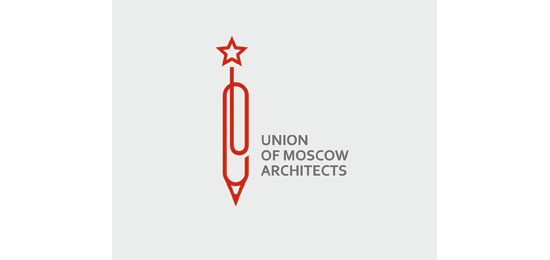
The logo above is from the Union of Moscow Architects. This logo is extremely different from the stereotypical Russia, this logo is very clean, minimal and diverse, as apposed to the very grand, loud image which is associated with Russia. The logo itself is a pen, which you can instantly link to the practice which it's representing, architecture. On the top of the pen, you can see the star, the star is a symbol from the Naval ensign of the Soviet Union. Another aspect of the logo is a paperclip. Paperclips are used to hold documents together, unite them, almost like a union. This goes with the name Union of Moscow Architects. The colour of the pen, the strong red, used internationally in Russia, on the flag, the red star. The walls of the Moscow Kremlin are also red, it's a colour associated with power, strength, all which Russia stands for, or even setting them apart from another Architects company.
No comments:
Post a Comment