
Wednesday 21 May 2014
Tuesday 20 May 2014
OUGD505: STUDIO BRIEF 2 - An Exhibition Of // Photographing Collateral
I've photographed the collateral I've produced for this brief, mainly so I can apply them to the boards and any external websites, such as Behance or my own website.


Monday 19 May 2014
OUGD505: STUDIO BRIEF 2 - An Exhibition of // Business Card & ID Cards
As part of the collateral range, I've created business cards and ID cards, which will later be placed in lanyards. I wanted to use a luxe method when making the business cards. To do this, I purchased some yellow card, best matching my colour scheme as I could, and stuck two sheets of them in between each side of the business cards.

Above is how four of them, stacked, look. The luxe business card effect has been created as the thickness and appearance of the business card has a feeling of quality to it, almost like they have been edge painted.
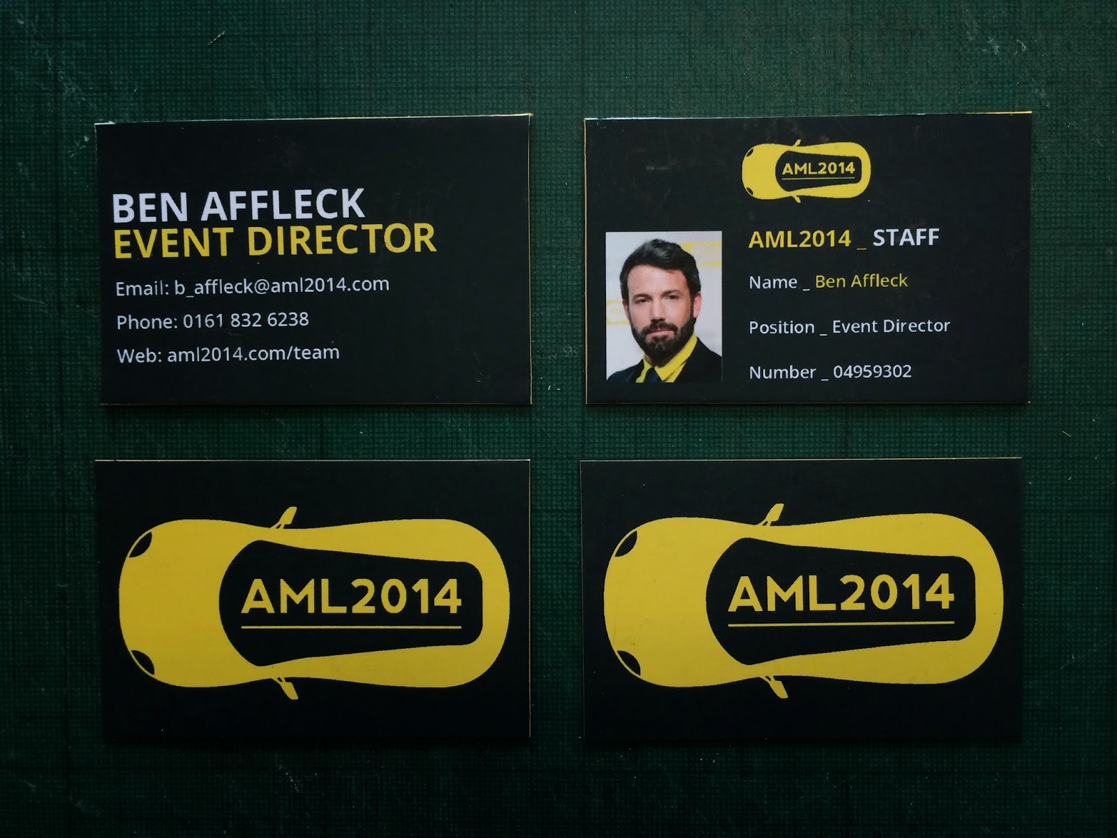
On the left, is the business card, creating using the order system established in the brand guidelines, open sans bold has been used for the header fond, and open sans regular for the information/body. The ID badge adopts the same method.

OUGD505: STUDIO BRIEF 2 - An Exhibition Of // Bottle Labels
Today, I was able to print the bottle labels for the shampoo and body wash bottles, which are pictured in a previous post. The bottles are to be a part of the hospitality package, in which the attendees of the event can use at their leisure during their stay at AML2014.

When mounting the labels on to the bottles, I had to assure they aligned properly, I did so using the grid system on a cutting mat, and a ruler to guide the bottle, as it rolled it over the sticker. The overall result is very pleasing. The colour schemes fit within the brand guidelines, and take pride of place within the rest of the brand collateral.
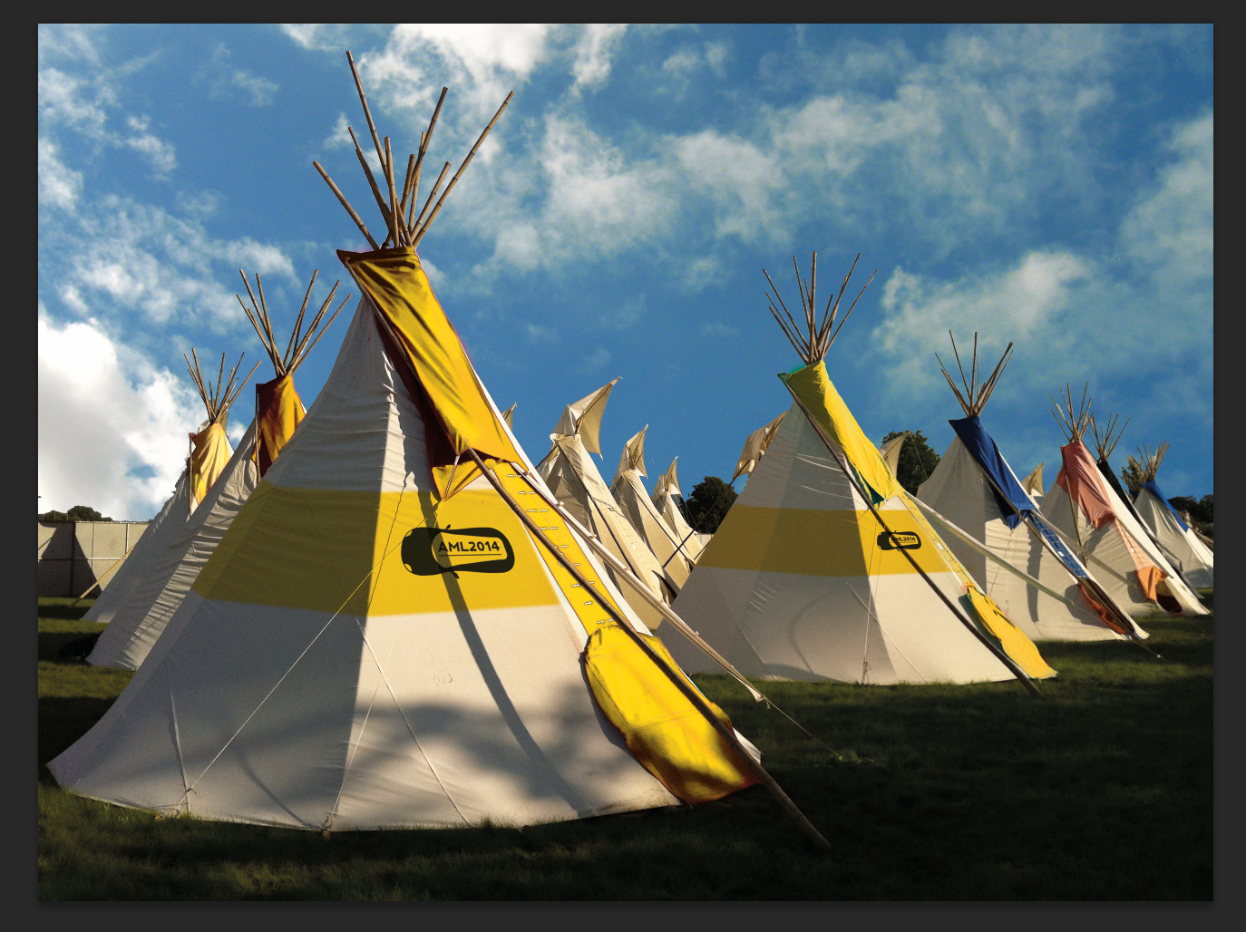
OUGD505: STUDIO BRIEF 2 - An Exhibition of // Proposing Accommodation
A huge part of the exhibition is the accommodation, where the VIP guests will stay, as the standard class tickets are required to bring their own tents. I wanted to use the concept of glamping, luxury teepees which are furnished with raised beds and running water. Taking the uncomfortable nature out of camping.
To do so, I searched for a stock photo of some teepees, a photo which was larger than 2000px wide, at a high resolution, to ease the editing process. And so when the image is produced in printed format, it retains a high, crisp, quality.
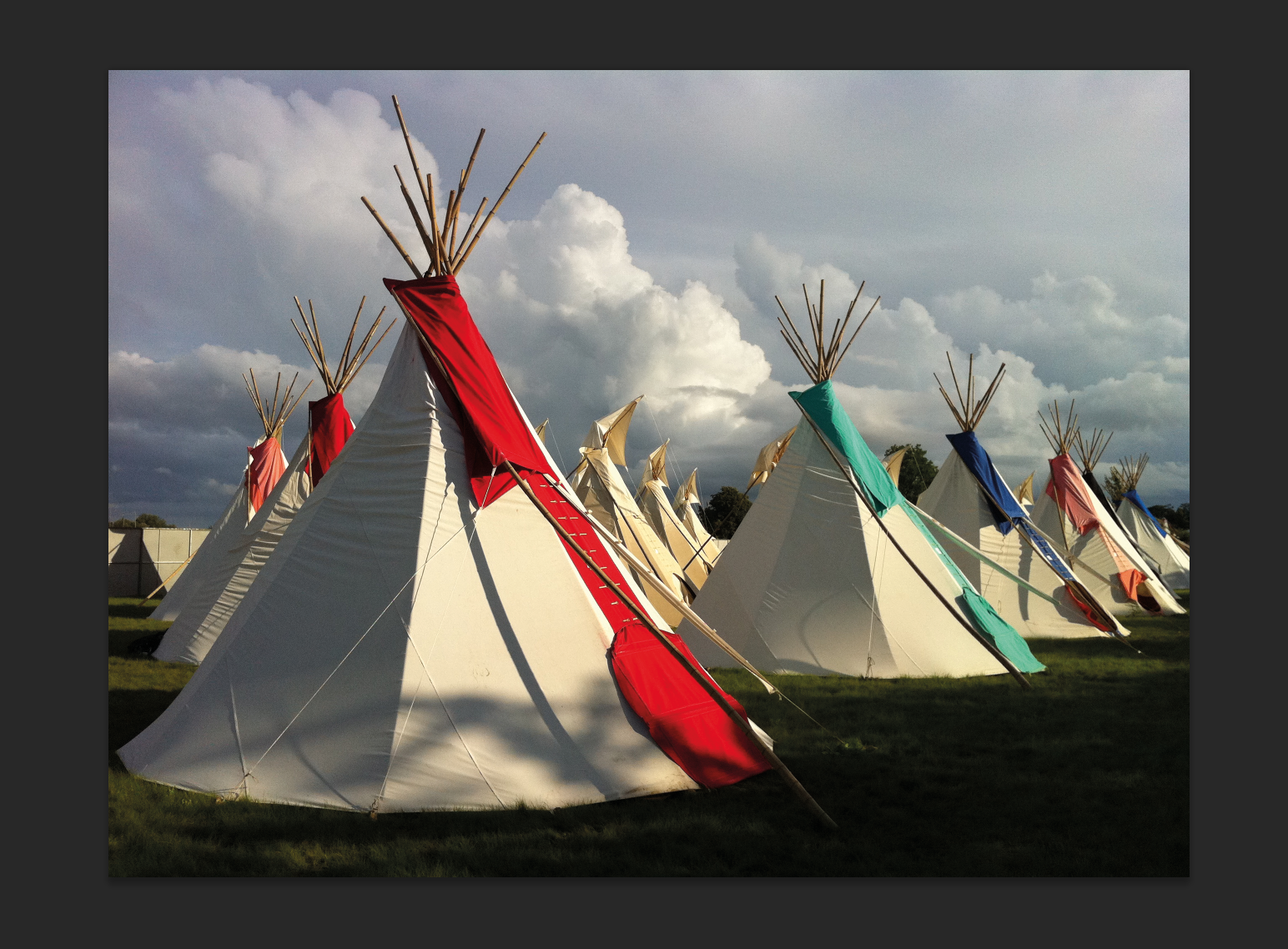
The photo depicts a range of teepees, however the image itself isn't very attractive, and it doesn't feel like it's part of my brand. Taking the image into photoshop to modify it's appearance to suit the needs of the project to a better extend.

I began by altering the skyline behind the focus of the image. It looked grey and dull, so I decided to replace it, for a more appealing look. I selected the foreground using the magic wand tool, following by the refine edge tool, to assure an accurate selection.
Using a layer mask over the selection, which turns all the areas in black into an alpha channel. The alpha channel then reveals the image below, the sky.
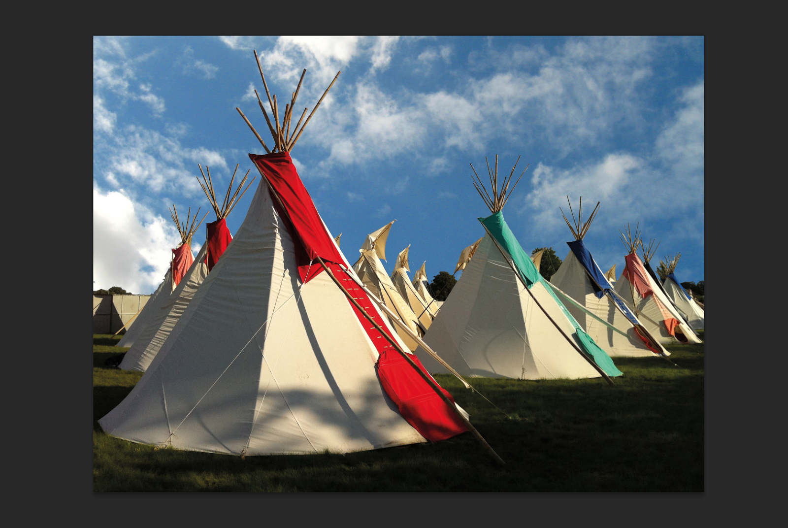

I then wanted to alter the colours of the tents, so they fit within the colour scheme of the event. Doing this will aid in the association of the brand. I once used the colour range tool in photoshop to select all the rends and all the greens and blue individually, to edit their hue and saturation, pushing them towards the brand colours.
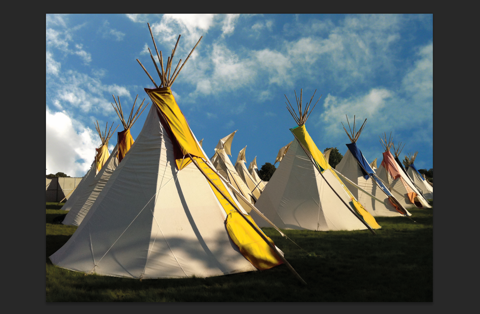

I then wanted to add a yellow banner around the side of the teepees to further enforce the brand within the teepees. On which I could place the logo. I did so by painting the yellow on the side of the tent, then applying the multiple blending mode over the top.

Finally adding the logo, to solidify the teepee's place within the AML2014 brand.
Sunday 18 May 2014


Subscribe to:
Posts (Atom)